Timeline
1 year
Role
User Testing, Strategy, UX Design, Workshop Design
Team
Jason Youn (CTO), Sara (VP of Operations)

What's wrong with Legacy Springboard?
We interviewed a range of credit union representatives to better understand the issues they faced when servicing members through the existing Springboard experience. Historically built and designed by developers, the application was inundated with an overwhelming amount of data, limited navigation, and confusing hierarchy.
1
Slow loading application
2
With Springboard, Credit unions’ CORE systems and Cardholder Maintenance, representatives have to navigate frequently between screens to accomplish a single task.
3
Representatives have to load one account at a time, making it difficult for reps to understand a holistic picture of each members on Springboard.
Team Structure
I worked in a cross-functional team to ship an MV1 of the Modernized Springboard experience. From leading the primary design direction, diverging on a navigational structure, and establishing Agile design cadences, I collaborated with key stakeholders to bring the Modernized experience to life.

Design Principles
In order to ensure consistency in designing the Legacy platform, I came up with a set of design principles that would enable the team to redesign the experience effectively and root decision making for more complex features, such as reporting Hot falcon blocks.
Maintain legacy Information
Enable consistency
Promote speed and focus
Member - centricity
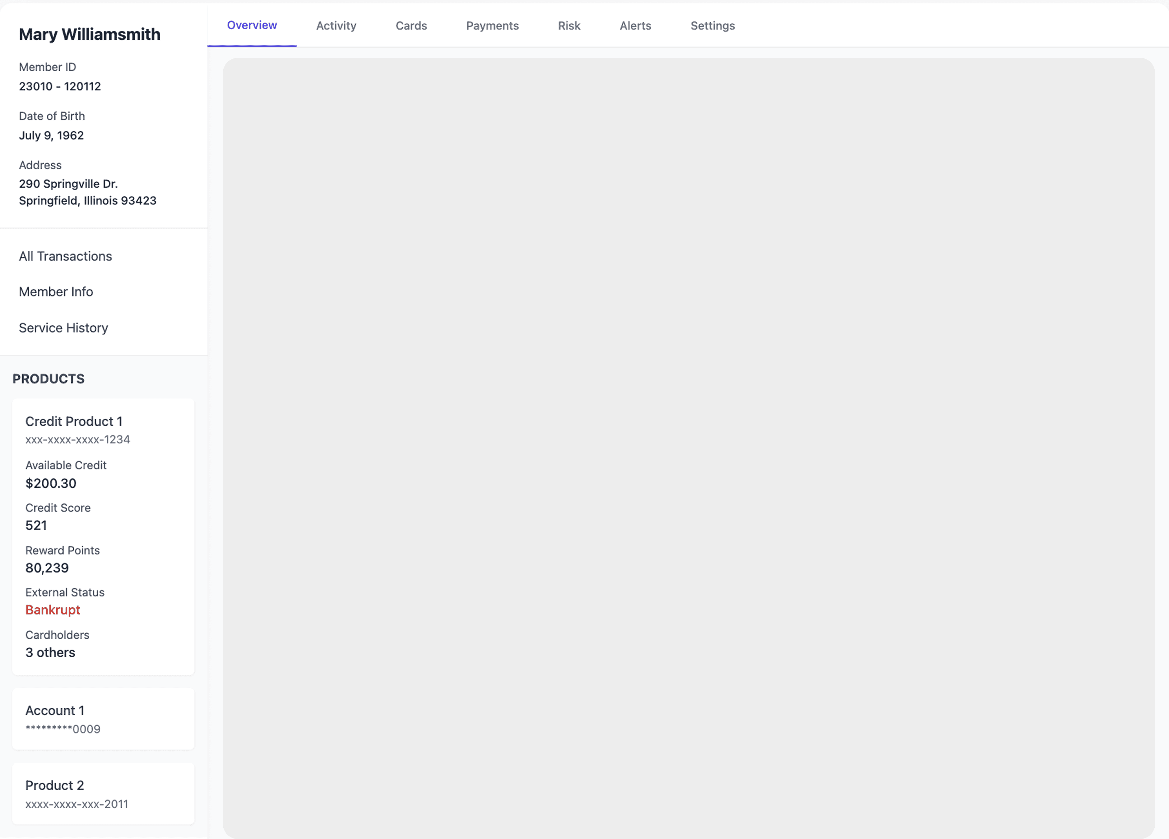
Information Architecture
I worked directly with Sara, the VP of Product Management at CO-OP solutions to identify the most important actions a credit union representative takes when servicing members. After identifying key areas in the site map, I focused on re-designing key UI elements from Legacy to start the foundation of a design system.

Establishing Navigation
Using the sitemap above, my design partner and I converged on a variety of different design directions to accommodate elements across the suite of features in Legacy Springboard.

After affinity mapping features and breaking down the taxonomy of Springboard, we concluded on a direction that would enable all Legacy features to be included in the Modernized experience at scale. This would allow representatives to view all products pertaining to an individual on the right, with tabs adjusting based on the product selected.
User Research
We iteratively tested the Springboard prototype with credit union representatives, taking a hypothesis-driven approach to validate usability tasks, from disputing a credit card lost/stolen to investigating transactions.

**An example of the Notion database Irene led to validate tasks in our Figma prototype.
“I love the look and feel of the Modern Experience. The ability to see a more holistic view of the members entire relationship with the credit union and still maintain the ability to drill down to that card level data is great. This will help us see how the individual transacts with the credit union and give us the ability to offer rewards and cross sell products that are more tailored to the members specific needs more efficiently.”
Neethu M.
Fraud Analyst, First Tech Credit Union
"The new system just makes everything easier. I don’t have to click through a bunch of screens to find what I need—it’s all right there. Now, I can focus on actually helping our members instead of wrestling with the software."
Dana
Cards Specialist, DOW Chemical Credit Union
Design system
I paired with the engineering team and contributed to the development of a design system that would enable the frontend team to more seamlessly design the revised Springboard experience and facilitate design-engineering handoff.
15%
Reduction in navigation time
The time it takes for a representative to navigate between products and identify transaction data.